はじめに
WordPressの仕組みやレスポンシブウェブデザインの全体像を理解するのと同時に、テクニックも身に付けたいという人におススメします。
テーマのインストール
テーマはresponsive.1.9.3.6を使います。このテーマをオリジナルのテーマにカスタムしていきます。解凍したフォルダはそのままでも、自由に名前を変更してもかまいません。
解凍したフォルダをwp-content/themes/へ置きます。
ローカル環境(XAMMP)で編集したい場合は↓
ローカル環境にWordPressをインストール
テーマ名の変更
まずテーマの名前を変更します。これは、テーマのアップデートを今後認識しないようにするためです。絶対変更しなくてもいいんですが、間違ってアップデートをしてしまうと、これから編集する箇所が書き換えられて面倒なことになります。
- wp-content/ themes/テーマフォルダ/style.css
一番上のほうにある、Theme Name: Responsiveを変更します。
例)Theme Name: PSW - 外観 > テーマ
利用可能なテーマに変更した名前のテーマがあると思います。それを有効化し完了です。

WordPressの初期設定
まずテーマをカスタマイズする前に基本的なところを大体入力しておきます。
- ユーザー > あなたのプロフィール
ニックネーム
ツールバー - 設定 > 一般
サイトのタイトル
キャッチフレーズ
WordPress アドレス (URL)
サイトアドレス (URL)
メールアドレス
日付のフォーマット - 設定 > 表示設定
RSS/Atom フィードでの各投稿の表示 - 設定 > メディア
サムネイルのサイズ - 設定 > パーマリンク設定
下準備
カテゴリを適当な数作り、カスタムメニューで並び順と親子関係を決め、位置をヘッダーにします。あと適当に記事を5~10作成しておきます。
- 投稿 > カテゴリー
適当な数(最低親2つ子1つ) - 外観 > メニュー
位置は、ヘッダー - 投稿 > 新規追加
5~10作成
必要なプラグインをインストール
デフォルトで入っているものと、定番のプラグインをインストールしておきます。
- WP Multibyte Patch
- Akismet
- All in One SEO Pack
- Contact Form 7
- Maintenance Mode
- Similar Posts
- Popular Posts
- WP-PageNavi
テーマをカスタマイズしていきます
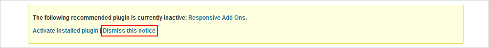
まず初めに、このテーマをインストールすると管理画面の上に↓が表示されるようになるので、Dismiss this noticeをクリックし非表示にします。
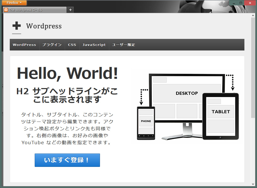
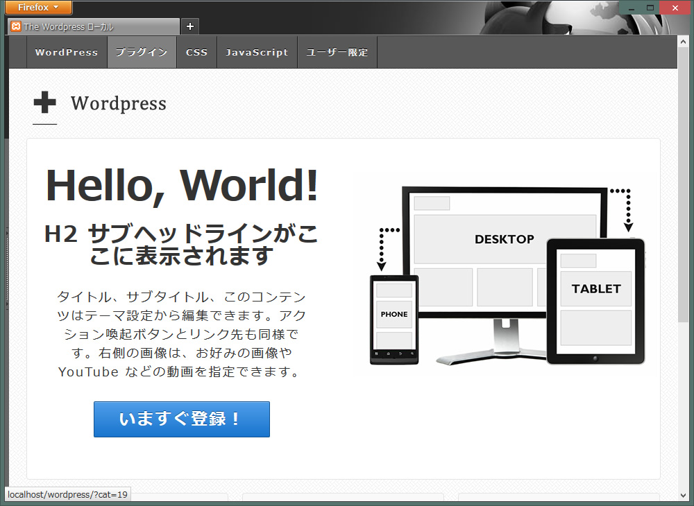
これから作成するテーマは、超シンプルにフラットなレスポンシブウェブデザインがテーマです。
それでは、適当にテーマのロゴを作ります。出来上がったら、外観 > ヘッダーで設定します。
基本的なことはこちらで説明しています。
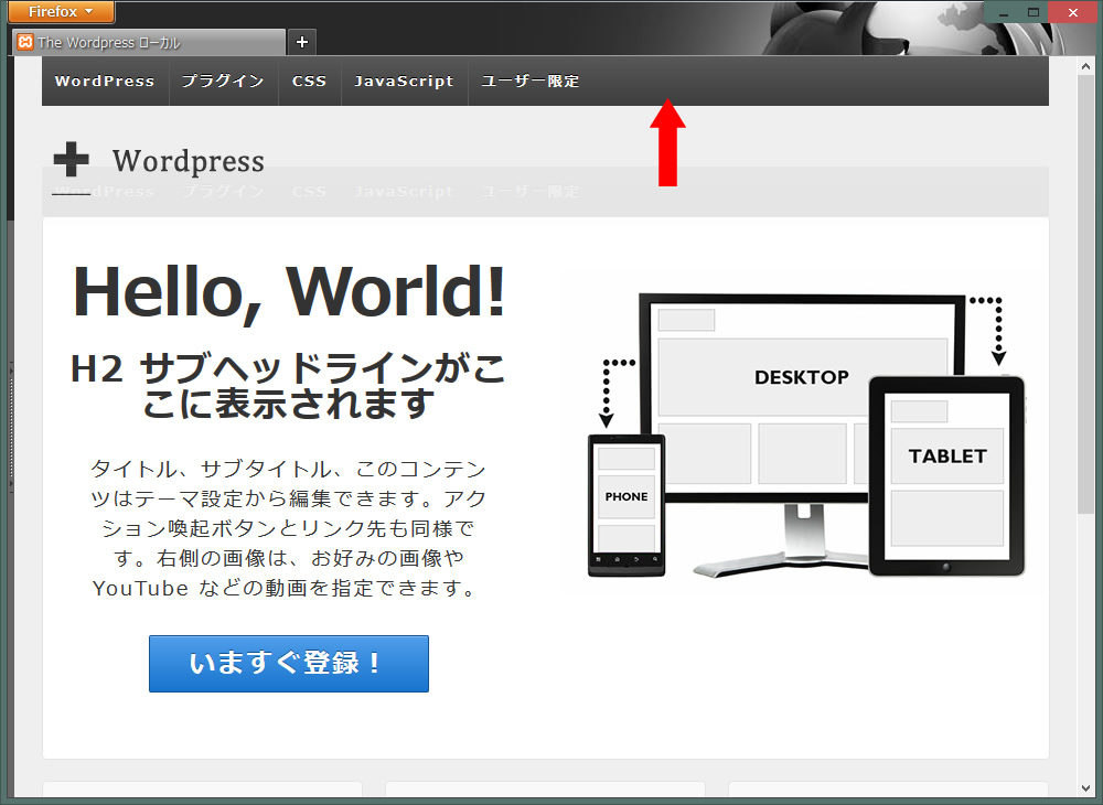
カテゴリメニューの場所を最上部に変更します
- header.phpを編集します。
12345678910111213141516<?php wp_nav_menu(array('container' => 'div','container_class' => 'main-nav','fallback_cb' => 'responsive_fallback_menu','theme_location' => 'header-menu'));?><?php if (has_nav_menu('sub-header-menu', 'responsive')) { ?><?php wp_nav_menu(array('container' => '','menu_class' => 'sub-header-menu','theme_location' => 'sub-header-menu'));?><?php } ?>
↑を<div id="header">の下に移動させます。
↓結果こうなります。
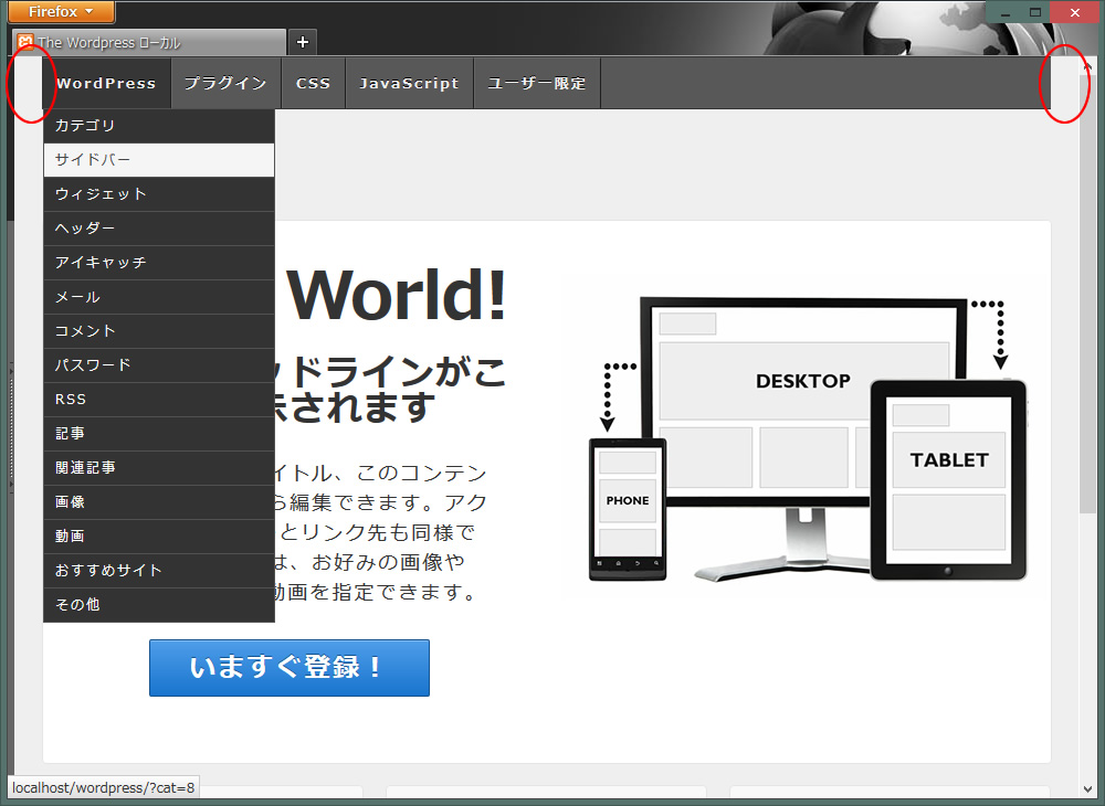
- カテゴリメニューのデザインを少し変更します。フラットなラバー感を出したいと思います。
wp-content/themes/テーマフォルダ/style.cssを編集
12345678910111213141516171819202122232425262728293031323334353637383940414243444546474849505152535455565758596061626364656667686970717273747576777879808182838485868788.main-nav {clear: both;background-color: #585858;}.menu {clear: both;margin-top: 0;margin-right: auto;margin-bottom: 0;margin-left: auto;border-top-width: 1px;border-right-width: 1px;border-bottom-width: 1px;border-left-width: 1px;border-top-style: solid;border-right-style: none;border-bottom-style: solid;border-left-style: solid;border-top-color: #333;border-right-color: #333;border-bottom-color: #333;border-left-color: #333;}.menu a {color: #F1F1F1;cursor: pointer;display: block;font-size: 13px;font-weight: 700;height: 45px;line-height: 45px;position: relative;text-decoration: none;text-shadow: 0 -1px 0 #000;padding-top: 0;padding-right: 0.9em;padding-bottom: 0;padding-left: 0.9em;border-right-width: 1px;border-right-style: solid;border-right-color: #1E1E1E;border-left-width: 1px;border-left-style: solid;border-left-color: #666;border-top-width: 1px;border-top-style: solid;border-top-color: #666;font-family: "メイリオ", Meiryo;margin-top: 0;margin-right: 0px;margin-bottom: 0;margin-left: 0;}.menu a:hover {background-color: #808080;color: #fff;}.menu li li {background-image: none;border: 1px solid #515151;color: #444;filter: none;margin: -1px 0 1px 0;width: auto;background-color: #333;}.menu li li a {background: transparent !important;border: none;color: #fff;font-size: 12px;font-weight: 400;height: auto;height: 20px;line-height: 20px;padding: 5px 10px;text-shadow: none;white-space: nowrap;}.menu li li:hover {filter: none;background-color: #000; !important;}
↓両端を背景で延長させます。
- bodyに背景を指定します。カテゴリメニュー用背景と、全体の背景2つを指定するというプチテクニックです。 style.cssには、2つbodyがありますが、Baseの方を書き換えます。
背景素材は、images/backに置きましたが、どこでも構いません。 - 背景素材 memu_back02.jpg
- 背景素材 cream_pixels.png
|
1 2 3 4 5 6 7 8 9 10 11 12 13 14 15 16 17 18 19 20 21 22 23 |
body { -moz-font-smoothing: antialiased; -webkit-font-smoothing: antialiased; color: #000; font-size: 14px; font-smoothing: antialiased; line-height: 1.5em; text-rendering: optimizeLegibility; background-attachment: scroll; font-family: "メイリオ", Meiryo; /*背景画像を2つ指定*/ background-image:url(../../../images/back/memu_back02.jpg),url(../../../images/back/cream_pixels.png); /*繰り返すかを指定*/ background-repeat:repeat-x,repeat; /*位置を指定*/ background-position:center top,0 0; } |
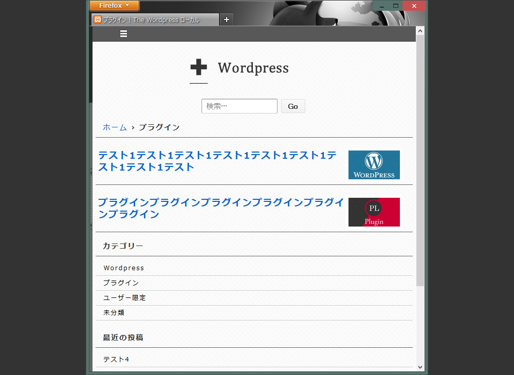
画面の幅が小さくなるにつれてカテゴリメニューの高さが変化します。それに合わせてメニューの背景も変更しなくてはなりません。これがレスポンシブウェブデザインのおもしろいところであり、作る側としては、少し大変なところです。
このテーマは、スタイルシートが↓の2枚に分かれています。名前が同じstyle.cssなので間違わないようにしてください。
- メインのスタイルシート
wp-content/themes/テーマフォルダ/style.css - 幅980px以下になった場合のスタイルシート
wp-content/themes/テーマフォルダ/core/css/style.css
@media screen and (max-width: 980px) {}
@media screen and (max-width: 650px) {}
@media screen and (max-width: 480px) {}
@media screen and (max-width: 320px) {}
@media screen and (max-width: 240px) {}
max-widthの大きさを変更すれば、その幅になった時にそのスタイルが適応されます。更に細かく指定したい場合、@media screen and…を追加してもかまいません。
スマホ・タブレット用のカテゴリメニューの編集
画面の幅が650px以下になった場合のカテゴリメニューのデザインと、その背景の高さを追加します。
wp-content/themes/テーマフォルダ/core/css/style.css
@media screen and (max-width: 650px) {}内を編集
- .js .main-navを編集
1234.js .main-nav {background-color: #585858;height: 31px;} - .js .main-nav .menu liを編集(background-color:)
12345.js .main-nav .menu li {float: none;background-color: #666;border: none;} - .js .main-nav .menu li aを編集(color: height: line-height:)
12345678910111213.js .main-nav .menu li a {color: #fff;font-size: 13px;font-weight: normal;height: 30px;line-height: 30px;padding: 0 15px;border: none;border-bottom: 1px solid #f5f5f5;text-shadow: none;text-align: left;cursor: pointer;} - .js .main-nav .menu li.current_page_item,
.js .menu .current_page_item a,
.js .menu .current-menu-item aを編集(background-color:)
12345.js .main-nav .menu li.current_page_item,.js .menu .current_page_item a,.js .menu .current-menu-item a {background-color: #333;} - .js .main-nav .menu li a:hover,
.js .main-nav .menu li li a:hoverを編集(background-color:)
123456.js .main-nav .menu li a:hover,.js .main-nav .menu li li a:hover {background-image: none;filter: none;background-color: #333!important;} - .js .main-nav .menu li ulを編集(background-color:)
12345.js .main-nav .menu li ul {position: static;visibility: visible;background-color: #000;} - bodyを編集(カテゴリメニューの背景の高さだけを調整)
1234body {/*位置を指定*/background-position:0 -17px,0 0;} - #responsive_current_menu_itemを追加(開閉ボタンの選択範囲をボタンのみにする)
123#responsive_current_menu_item {visibility: hidden;} - ↓を編集すると開閉ボタンの画像、位置が変更できますが、そのままでいきます。
123456789101112131415.js .main-nav a#responsive_menu_button {position: absolute;display: block;top: 0;left: 100%;height: 30px;width: 23px;margin-left: -30px;background: url('../images/select-icons.png') 0 5px no-repeat;cursor: pointer;}.js .main-nav a#responsive_menu_button.responsive-toggle-open {background: url('../images/select-icons.png') 0 -46px no-repeat;}
以上でレスポンシブなカテゴリメニューの編集は完了です。
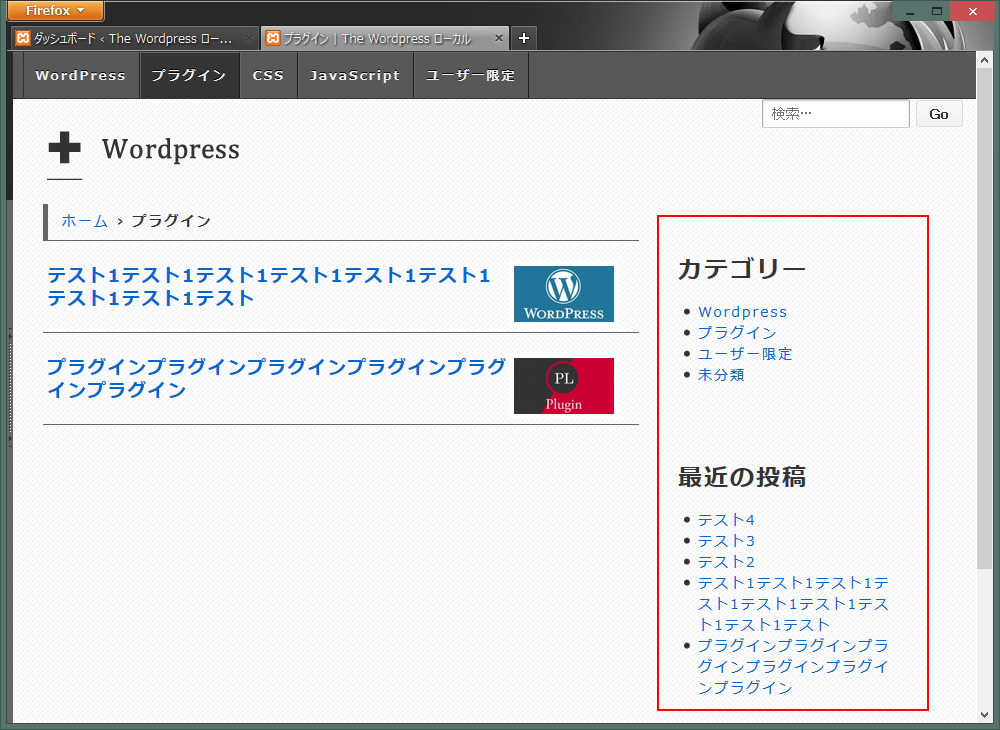
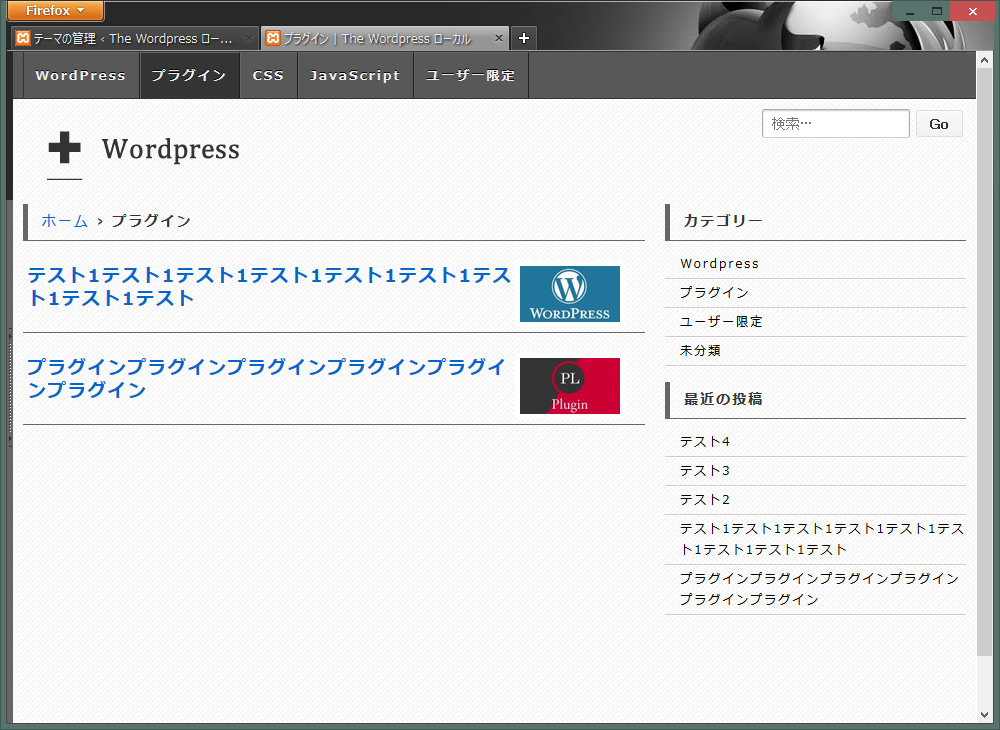
カテゴリページと検索結果のページを編集
カテゴリページを表示し必要ないものを消していきます。
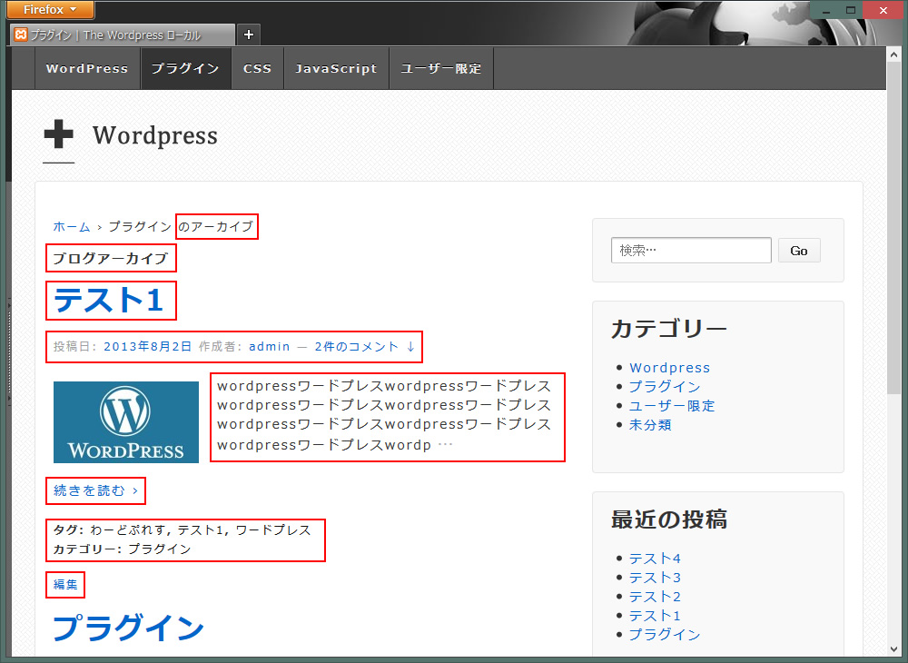
今回のサイトで使わない部分を削除していきますが、その結果サムネイルとタイトルのみになります。
- パンくずリストの「のアーカイブ」を非表示にする(502行あたり)
wp-content/themes/core/includes/functions.php
1234567/* === OPTIONS === */$text['home'] = __('Home','responsive'); // text for the 'Home' link$text['category'] = __('Archive for %s','responsive'); // text for a category page$text['search'] = __('Search results for: %s','responsive'); // text for a search results page$text['tag'] = __('Posts tagged %s','responsive'); // text for a tag page$text['author'] = __('View all posts by %s','responsive'); // text for an author page$text['404'] = __('Error 404','responsive'); // text for the 404 page
> Archive for
> Search results for:
> Posts tagged
> View all posts by%sだけ残し↑4つを削除します。結果↓
1234567/* === OPTIONS === */$text['home'] = __('Home','responsive'); // text for the 'Home' link$text['category'] = __('%s','responsive'); // text for a category page$text['search'] = __('%s','responsive'); // text for a search results page$text['tag'] = __('%s','responsive'); // text for a tag page$text['author'] = __('%s','responsive'); // text for an author page$text['404'] = __('Error 404','responsive'); // text for the 404 page - wp-content/themes/の中のphpを編集していきます。
- ブログのアーカイブを非表示にする
loop-header.phpの↓を削除12345678910111213<h6 class="title-archive"><?phpif ( is_day() ) :printf( __( 'Daily Archives: %s', 'responsive' ), '<span>' . get_the_date() . '</span>' );elseif ( is_month() ) :printf( __( 'Monthly Archives: %s', 'responsive' ), '<span>' . get_the_date( 'F Y' ) . '</span>' );elseif ( is_year() ) :printf( __( 'Yearly Archives: %s', 'responsive' ), '<span>' . get_the_date( 'Y' ) . '</span>' );else :_e( 'Blog Archives', 'responsive' );endif;?></h6>
その下の検索結果ページのタイトル部分も変更しておきます。1<h6 class="title-search-results"><?php printf(__('Search results for: %s', 'responsive' ), '<span>' . get_search_query() . '</span>'); ?></h6>↓に変更
1<div class="breadcrumb-list"><?php printf(__('Search results for: %s', 'responsive' ), '<span>' . get_search_query() . '</span>'); ?></div> - タイトル(テスト1)を削除。タイトルは、あとで違う形で追加します。
archive.phpの↓を削除1<?php get_template_part( 'post-meta' ); ?> - 投稿日、作成者、コメント数を非表示にする(他でも表示されないように)
post-meta.phpの↓を削除12345678910<div class="post-meta"><?php responsive_post_meta_data(); ?><?php if ( comments_open() ) : ?><span class="comments-link"><span class="mdash">—</span><?php comments_popup_link( __( 'No Comments ↓', 'responsive' ), __( '1 Comment ↓', 'responsive' ), __( '% Comments ↓', 'responsive' ) ); ?></span><?php endif; ?></div><!-- end of .post-meta --> - 抜粋記事を非表示にする
archive.phpの↓を削除
1<?php the_excerpt(); ?> - タグ、カテゴリ、編集を非表示にする
archive.phpの↓を削除1<?php get_template_part( 'post-data' ); ?> - ついでに検索結果のページの編集も非表示にしておきます。
search.phpの↓を削除
1<?php get_template_part( 'post-data' ); ?> - 続きを読むを非表示にする
wp-content/themes/responsive/core/includes/functions.phpへ↓を追加する。(一番下に追加すればOK)
1234function new_excerpt_more($more) {return '';}add_filter('excerpt_more', 'new_excerpt_more');
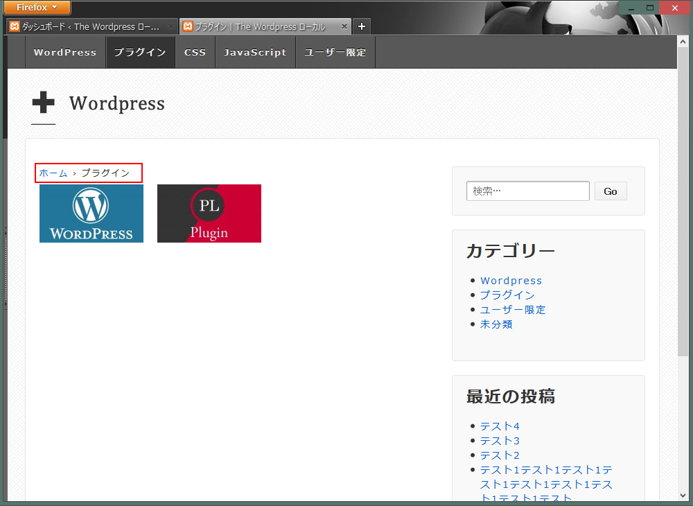
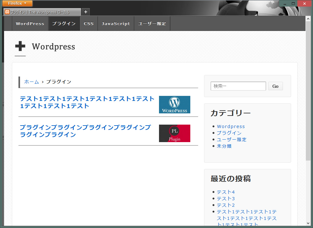
記事のタイトルを追加し、スタイルシートでパンくずリスト含め全体のバランスを調整します。※タイトル名は調整しやすいように長くしました。
- まずカテゴリページと検索結果ページ用のサムネイルに独自のスタイルを定義するため、archive.phpとsearch.phpのclassを変更します。
1<div class="post-entry">
↓変更
1<div class="item1"> - 記事のタイトルを追加
archive.phpを編集します。
123456789<div class="item1"><?php if ( has_post_thumbnail()) : ?><a href="<?php the_permalink(); ?>" title="<?php the_title_attribute(); ?>" ><?php the_post_thumbnail('thumbnail', array('class' => 'alignleft')); ?></a><?php endif; ?><?php wp_link_pages(array('before' => '<div class="pagination">' . __('Pages:', 'responsive'), 'after' => '</div>')); ?></div>
↑に↓を追加します。
1<h2><a href="<?php the_permalink(); ?>"><?php the_title(); ?></a></h2>
↓完成
12345678910<div class="item1"><?php if ( has_post_thumbnail()) : ?><a href="<?php the_permalink(); ?>" title="<?php the_title_attribute(); ?>" ><?php the_post_thumbnail('thumbnail', array('class' => 'alignleft')); ?></a><h2><a href="<?php the_permalink(); ?>"><?php the_title(); ?></a></h2><?php endif; ?><?php wp_link_pages(array('before' => '<div class="pagination">' . __('Pages:', 'responsive'), 'after' => '</div>')); ?></div> - パンくずリストを編集します。(ホーム > プラグイン)のところです。
スタイルシート(style.css)の.breadcrumb-listを編集します。
1234567891011121314151617.breadcrumb-list {margin-bottom: 10px;margin-top: 5px;border-left-width: 5px;border-left-style: solid;border-left-color: #666;text-indent: 1em;border-bottom-width: 1px;border-bottom-style: solid;border-bottom-color: #666;padding-top: 7px;padding-right: 0px;padding-bottom: 8px;padding-left: 0px;font-weight: bold;font-size: 14px;} - サムネイルを調整します。↓を追加。
12345678910111213141516171819202122232425262728#content-archive .item1, #content-search .item1 {margin-right: 1px;margin-left: 0px;border-bottom-width: 1px;border-bottom-style: solid;border-bottom-color: #666;margin-bottom: 10px;padding: 0px;width: 100%;float: left;margin-top: 10px;vertical-align: top;}#content-archive .item1 img, #content-search .item1 img {-moz-box-sizing: border-box;-webkit-box-sizing: border-box;box-sizing: border-box;background-color: #FFF;border: 1px solid #FFF;padding: 4px;margin-top: 0px;margin-bottom: 5px;margin-left: 0px;width: 110px;float: right;margin-right: 0px;}
幅240px以下でサムネイルを非表示にします。
@media screen and (max-width: 240px) {} 内に↓を追加
123#content-archive .item1 img, #content-search .item1 img {display: none;} - タイトルのバランスを調整します。↓を追加。
1234567891011121314#content-archive h2, #content-search h2 {margin: 0px;padding: 0px;}#content-archive h2 a, #content-search h2 a {line-height: 1.3em;font-size: large;display: block;padding-right: 5px;padding-left: 5px;padding-top: 3px;padding-bottom: 0px;}
幅320px以下でタイトルのフォントサイズをmediumにし、微調整
@media screen and (max-width: 320px) {} 内に↓を追加
1234#content-archive h2 a, #content-search h2 a {font-size: medium;margin-bottom: 20px;} - ページナビを入れます。プラグインWP-PageNaviを使います。
archive.phpとsearch.phpの↓を変更し、その下にWP-PageNavi用のタグを挿入
1234567891011<?phpendwhile;get_template_part( 'loop-nav' );else :get_template_part( 'loop-no-posts' );endif;?>
↓こんな感じ
12<?php endwhile;endif; ?><?php wp_pagenavi(); ?>
bodyの背景以外はすべて消し、全体の幅をワイドに
- #wrapperと.widget-wrapperの調整
#wrapper 背景とボーダーを削除し、サイドの余白も削除
12345678910#wrapper {clear: both;position: relative;margin-top: 0px;margin-right: auto;margin-bottom: 2%;margin-left: auto;padding-top: 0px;padding-bottom: 2%;}
.widget-wrapper 背景とボーダーを削除
1234.widget-wrapper {margin: 0 0 20px;padding: 20px;} - 更にワイドに
#container
1234567891011#container {max-width: 960px;margin-top: 0;margin-right: auto;margin-bottom: 0;margin-left: auto;padding-top: 0px;padding-right: 1%;padding-bottom: 0px;padding-left: 1%;}
パンくずリスト&検索結果タイトルの調整
- ウィジェットの検索をメインサイドバーからTop Widgetへ移動させました。
- マージンを削除しコンテンツの高さを調整します。
#content-archiveのmargin-top: 40px;を削除
123#content-archive {margin-bottom: 20px;} - こちらもマージンを削除しコンテンツの高さを調整します。
#content-searchのmargin-top: 20px;を削除
123#content-search {margin-bottom: 20px;}
サイドバーを調整
- まず最初にTop Widgetに移動させた検索を調整します。
#top-widget
1234#top-widget {margin-bottom: 5px;margin-top: 10px;} - 幅980px以下の調整をします。
wp-content/themes/テーマフォルダ/core/css/style.css
@media screen and (max-width: 980px) {}内の↓を削除。
1234.top-widget,.front-page .top-widget {margin-top: 0 !important;} - サイドバーのウィジェットの調整をします。
.widget-wrapper
1234.widget-wrapper {padding-bottom: 10px;margin: 0;} - サイドバーのタイトルをパンくずリストのデザインに統一します。
.widget-title を
.breadcrumb-listに追加します。
12345678910111213141516.breadcrumb-list, .widget-title {margin-bottom: 10px;margin-top: 5px;border-left-width: 5px;border-left-style: solid;border-left-color: #666;text-indent: 1em;border-bottom-width: 1px;border-bottom-style: solid;border-bottom-color: #666;padding-top: 7px;padding-right: 0px;padding-bottom: 8px;padding-left: 0px;font-weight: bold;} - .widget-title, .widget-title-home h3を調整
12345.widget-title,.widget-title-home h3 {clear: both;font-size: 16px;} - #widgetsを調整
12345#widgets {padding-bottom: 2%;border: 1px none #CCC;padding-top: 0px;} - #widgets ul li a を追加、調整します。
↓を削除
123456789#widgets ul,#widgets ol {padding: 0 0 0 20px;}#widgets ul li a {display: inline;text-decoration: none;}
↓を追加(記事内のliに反応するので.post-entry系を削除)
123456789101112131415161718192021222324252627282930313233343536373839#widgets a {display: inline-block;text-decoration: none;padding-top: 0px;padding-bottom: 0px;}#widgets ul {margin-left: 0px;padding: 0px;margin-top: 0px;margin-right: 0px;margin-bottom: 0px;}#widgets li {list-style-type: none;display: block;border-bottom-width: 1px;border-bottom-style: solid;border-bottom-color: #FFF;}#widgets ul li a {text-decoration:none;border-bottom-width: 1px;border-bottom-color: #CCC;padding-top: 3px;padding-bottom: 3px;padding-left: 15px;color: #000;font-size: 12px;border-bottom-style: solid;display: block;}#widgets ul li a:hover {border-bottom-color: #999;}
最終調整
- 幅980px以下の時、パンくずリストとサイドバー(タイトル)の左ボーダーを非表示にします。
wp-content/themes/テーマフォルダ/core/css/style.css
@media screen and (max-width: 980px) {}内へ↓を追加
123.breadcrumb-list, .widget-title {border-left-style: none;}
↑画面縮小時の状態
検索結果ページを編集
- 検索結果ページは、抜粋記事を残しつつサムネイルを追加します。 なぜカテゴリページとは違う感じにするのかは、抜粋があるほうがいいのか、ないほうがいいのか2パターン見たいからです。どうするかは経過を見ながら最後に決めます。
- search.phpを編集します。
12345<div class="item1"><?php the_excerpt(); ?><?php wp_link_pages(array('before' => '<div class="pagination">' . __('Pages:', 'responsive'), 'after' => '</div>')); ?></div><!-- end of .post-entry -->↓に変更
12345678<div class="item1"><?php if ( has_post_thumbnail()) : ?><a href="<?php the_permalink(); ?>" title="<?php the_title_attribute(); ?>" ><?php the_post_thumbnail('thumbnail', array('class' => 'alignleft')); ?></a><?php the_excerpt(); ?><?php endif; ?></div><!-- end of .item1 --> - 微調整のため.item1 pを追加します。
12345678.item1 p {margin: 0px;line-height: 1.7em;padding-top: 2px;padding-right: 5px;padding-bottom: 15px;padding-left: 5px;}
そろそろシングルページにいきたいけど、最近の投稿にサムネイルをいれてもいいかな、いるかなあ?サムネイル?とりあえずシングルページに行きましょう。
シングルページ(投稿ページ)編集
パンくずリストの編集と、記事のタイトルの文字の大きさを調整します。
メインのスタイルシート(style.css)のみで編集していきます。
- パンくずリストの記事タイトルを非表示にします。
#content .breadcrumb-currentを追加
123#content .breadcrumb-current{display: none;} - コンテンツの高さを調整します。
#contentを編集(margin-topを削除)
123#content {margin-bottom: 20px;} - メインの記事タイトルを調整します。
#content .post-titleを追加
123456789#content .post-title{border-bottom-width: 1px;border-bottom-style: solid;border-bottom-color: #666;padding-bottom: 10px;line-height: 1.5em;font-size: 18px;padding-left: 5px;} - 現時点でのこのサイトの独自の調整ですが、
.post-entry 系を追加 、編集
123456789101112131415161718192021222324252627282930313233343536373839404142434445464748495051525354555657585960616263646566676869707172737475767778798081828384858687888990919293949596979899100101102103104.post-entry {margin-top: 20px;margin-bottom: 20px;padding-right: 5px;padding-left: 5px;}.post-entry ul {margin: 0px;padding-right: 1%;padding-left: 1%;}.post-entry ul li {border-top-style: none;border-right-style: none;border-bottom-style: dashed;border-left-style: none;line-height: 2em;border-bottom-width: 1px;border-bottom-color: #999;padding-bottom: 10px;padding-top: 10px;margin-top: 20px;list-style-type: none;}.post-entry a, .post-entry ul li a {color: #06C;border-top-style: none;border-right-style: none;border-bottom-style: none;border-left-style: none;clear: none;float: none;margin: 0px;padding: 0px;font-weight: bold;font-size: 16px;text-decoration: underline;}.post-entry a:hover, .post-entry ul li a:hover {color: #F00;}.post-entry h2 {padding: 10px;font-weight: bold;color: #333;margin-bottom: 10px;margin-top: 10px;border-top-width: 1px;border-right-width: 1px;border-bottom-width: 1px;border-left-width: 1px;border-top-style: solid;border-right-style: solid;border-bottom-style: solid;border-left-style: solid;border-top-color: #F6F6F6;border-right-color: #E1E1E1;border-bottom-color: #999;border-left-color: #E1E1E1;font-size: large;background-color: #FC3;}.post-entry h3 {color: #FFF;background-color: #666;padding: 10px;font-size: 14px;}.post-entry img {clear: both;}.post-entry p {line-height: 2em;padding-top: 0px;padding-right: 1%;padding-bottom: 0px;padding-left: 1%;}.post-entry strong {color: #039;font-size: 16px;}.post-entry_social_bookmarking_light {margin-top: 10px;float: left;}.click {color: #C00;font-weight: bold;font-size: 16px;padding-right: 5px;padding-left: 5px;}

シングルページ下部の編集
関連記事の編集をします。プラグインSimilar Postsをインストール、設定済みということで進めていきます。
- サムネイルの下にタイトルという感じにしてみました。デザインは大体で進めていきます。サイトの全体像が見えてきてからでも変更したいと思います。
1234567891011121314151617181920212223242526272829.similar-posts {width: 100%;}.similar {margin-bottom:10px;margin-left: 1%;float: left;height: 180px;width: 140px;}.similar img {padding:4px;width: 130px;background-color: #FFF;border: 1px solid #FFF;margin: 0;}.similar_title a {padding-top: 5px;display: block;width: 125px;float: left;font-size: 12px;padding-left: 5px;padding-right: 5px;padding-bottom: 5px;line-height: normal;} - 関連記事タイトルのスタイルを統一します。
.breadcrumb-list, .widget-titleへ.simを追加
1234567891011121314151617.breadcrumb-list, .widget-title, .sim {margin-bottom: 10px;margin-top: 5px;border-left-width: 5px;border-left-style: solid;border-left-color: #666;text-indent: 1em;border-bottom-width: 1px;border-bottom-style: solid;border-bottom-color: #666;padding-top: 7px;padding-right: 0px;padding-bottom: 8px;padding-left: 0px;font-weight: bold;font-size: 14px;} - 幅980px以下の時、関連記事の左のボーダーを非表示にします。
wp-content/themes/テーマフォルダ/core/css/style.css
@media screen and (max-width: 980px) {}内の.breadcrumb-list, .widget-title,へ.simを追加
1234.breadcrumb-list, .widget-title, .sim {border-left-style: none;} - 次の記事、前の記事のリンクがいらないので削除します。
single.phpの↓を削除
1234<div class="navigation"><div class="previous"><?php previous_post_link( '‹ %link' ); ?></div><div class="next"><?php next_post_link( '%link ›' ); ?></div></div><!-- end of .navigation --> - Similar Postsの標準設定だとタグとカテゴリが関連記事の下になってしまうので、タグをpost-dataの下に入力します。
12<?php get_template_part( 'post-data' ); ?><?php similar_posts(); ?>
タグとカテゴリの微調整↓
1234567891011.post-data {clear: both;font-size: 12px;font-weight: 700;margin-top: 20px;margin-bottom: 20px;padding-left: 14px;}.post-data a {}
タグとカテゴリを非表示にしたい場合↓
123.post-data {display: none;}
※phpの編集がめんどくさい場合は、display: noneでとりあえず非表示というのもアリです。 - 編集が邪魔なので消します。
post-data.php 内の↓を削除
1<div class="post-edit"><?php edit_post_link(__('Edit', 'responsive')); ?></div> - おしゃれな角丸のコメント欄ですが、
フラットでソリッドなシンプルスタイルに変えます。
#respond1234567#respond {border: 1px solid #cccccc;border-bottom-color: #aaaaaa;clear: both;margin-top: 15px;padding: 10px 20px 50px;} - コメント件数を表示する#commentsを微調整
#pings, #comments12345#pings,#comments {text-align: left;clear: both;}
これで基本的なところは完成です。あとは記事を投稿しつつ調整していく感じです。ここからは、少しオシャレなやつを追加していこうと思います。
テキストとサムネイルに装飾と動きを付けてみます。
- CSS3のボックスシャドウ、テキストシャドウ、ホバータイムを割り当てます。
サムネイルにボックスシャドウをかけます。サムネイルに触れたらシャドウがかかります。
123456789101112131415161718192021/* ボックスシャドウ */.item1 img:hover, .similar img:hover {-webkit-box-shadow: 0 10px 8px -6px #8d8c8c;-moz-box-shadow: 0 10px 8px -6px #8d8c8c;box-shadow: 0 10px 8px -6px #8d8c8c;border-top-width: 1px;border-right-width: 1px;border-bottom-width: 1px;border-left-width: 1px;border-top-style: solid;border-right-style: solid;border-bottom-style: solid;border-left-style: solid;border-top-color: #F1F1F1;border-right-color: #F1F1F1;border-bottom-color: #FFF;border-left-color: #F1F1F1;background-image: none;background-color: #FFF;} - 上部のカテゴリメニュー以外(#wrapper内)すべてにテキストシャドウをかけます。1pxのシャドウがかかり文字が浮き出てるように見えます。
123456/* テキストシャドウ */#wrapper {text-shadow: 1px 1px 1px #E1E1E1;} - ホバータイムの時間を0.2sで統一します。#wrapper内のリンク、画像がふわふわっと変化します。
123456789/* ホバータイム */#wrapper a ,#wrapper img {-webkit-transition: 0.2s;-moz-transition: 0.2s;-o-transition: 0.2s;-ms-transition: 0.2s;transition: 0.2s;}
トップページを編集します。
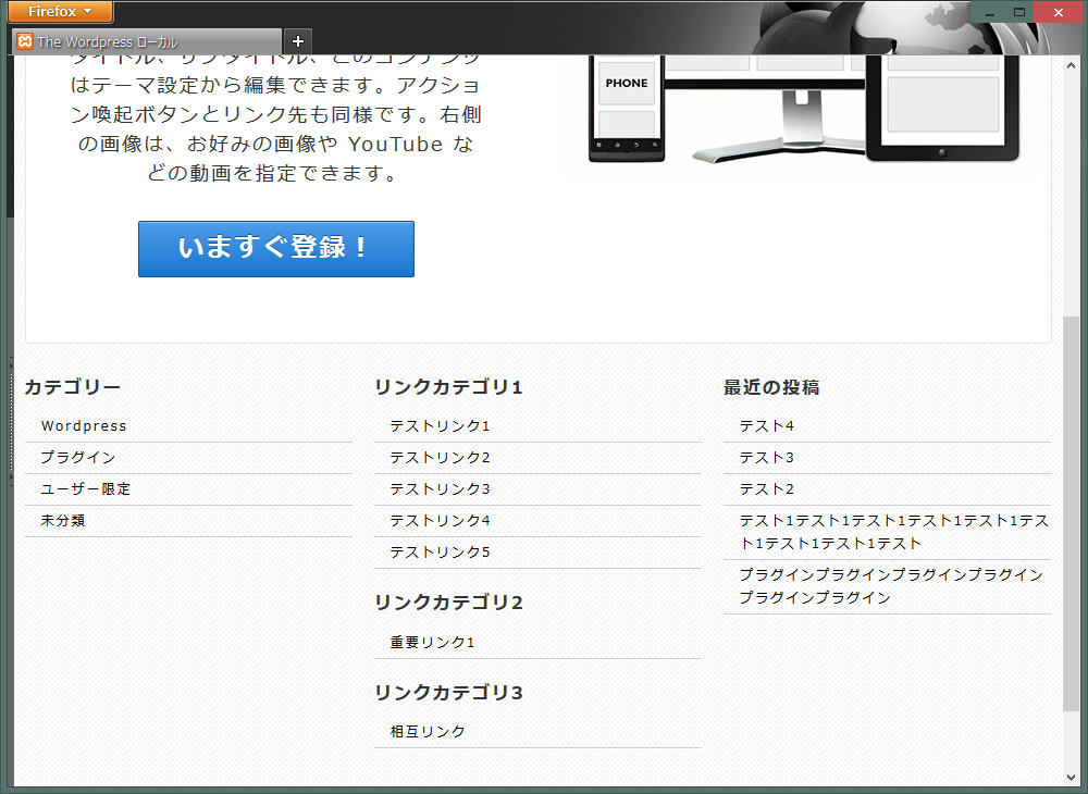
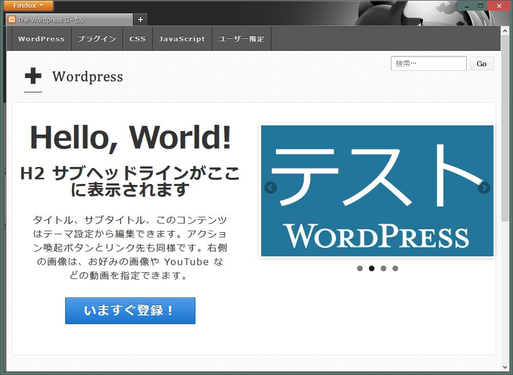
このテーマの既存のトップページを使うのであれば、右側に画像または、スライドショー、動画(YouTube)を挿入することができます。
まずは簡単なので動画(YouTube)を入れてみます。
外観 > テーマ設定> ホームページ
おすすめコンテンツに動画のソース(YouTube> 共有 > 埋め込みコード)を挿入すれば完了です。

次にスライドショーを入れてみます。プラグイン WordPress Slider Plugin を使います。
これもおすすめコンテンツにショートコードを挿入すれば完了です。
肝心なのはこの下に何をどう置くのかが問題です。
↓今はこんな感じのウィジェットのみになっていますが、この間にサムネイル付のカテゴリ別記事を置きたいと思います。

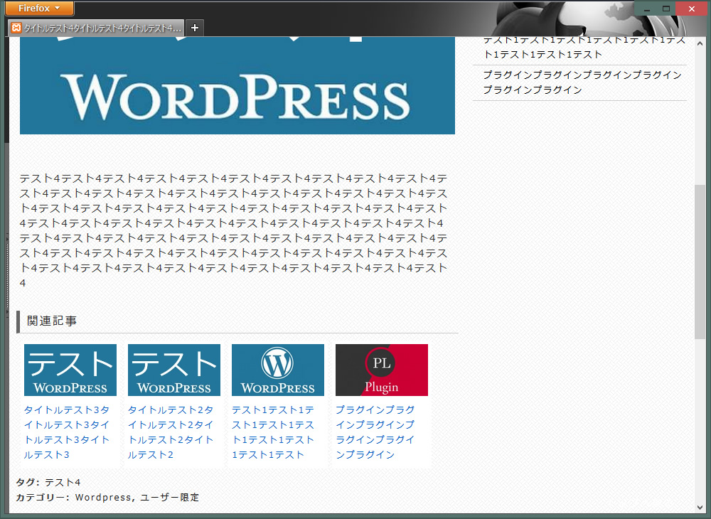
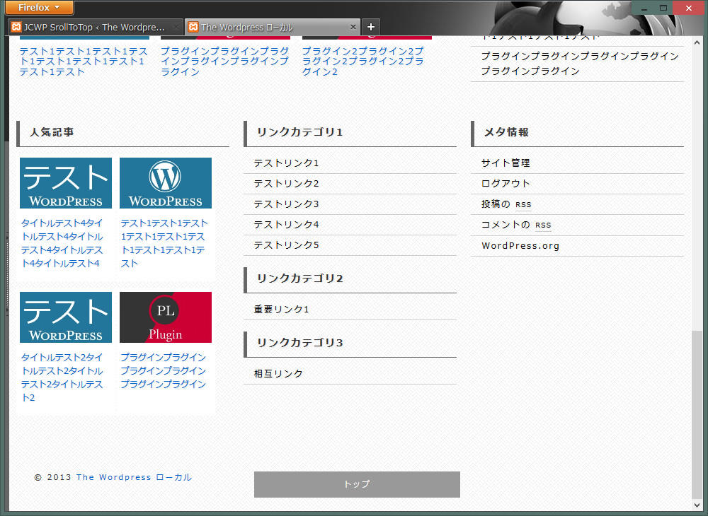
まず完成したものは↓こちらです。2つのカテゴリから新着記事を呼び出しています。文字化けしているところもありますが。
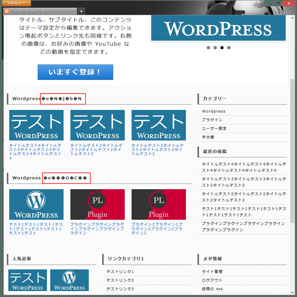
front-page.phpを編集しますが、php内に日本語を挿入すると文字化けしてしまいます。よくあることなので、ポイントとして上げておきます。UTF-8にエンコーディングすれば、日本語も挿入できるようになります。
Dreamweaverの場合、front-page.phpを開いた状態で、ページプロパティ > タイトル/エンコーディング > エンコーディング > UTF-8 > OK
front-page.phpを編集します。
<!– end of #featured –>の後に↓を挿入
|
1 2 3 4 5 6 7 8 9 10 11 12 13 14 15 16 17 18 19 20 21 22 23 24 25 26 27 28 29 30 31 32 33 34 35 36 37 38 39 40 41 |
<!--front #content-blog--> <div id="content-blog" class="<?php echo implode( ' ', responsive_get_content_classes() ); ?>"> <div class="widget-title">WordPressテクニック</div> <?php $loop = new WP_Query('cat=2&showposts=6'); while ( $loop->have_posts() ) : $loop->the_post(); ?> <li class="post_home"> <div class="item1"><a href="<?php the_permalink() ?>"> <?php the_post_thumbnail('medium'); ?> </a></div> <h2><a href="<?php the_permalink(); ?>"> <?php the_title(); ?> </a></h2> </li> <?php endwhile;wp_reset_query(); ?> <div class="widget-title">WordPress プラグイン</div> <?php $loop = new WP_Query('cat=19&showposts=6'); while ( $loop->have_posts() ) : $loop->the_post(); ?> <li class="post_home"> <div class="item1"><a href="<?php the_permalink() ?>"> <?php the_post_thumbnail('medium'); ?> </a></div> <h2><a href="<?php the_permalink(); ?>"> <?php the_title(); ?> </a></h2> </li> <?php endwhile;wp_reset_query(); ?> </div> <!-- end of front #content-blog --> <!-- front サイドバー --> <?php get_sidebar(); ?> <!-- end of front サイドバー --> |
↑に2カ所挿入している↓の部分だけ説明しておきます。
|
1 2 3 4 |
<?php $loop = new WP_Query('cat=2&showposts=6'); while ( $loop->have_posts() ) : $loop->the_post(); ?> |
cat=2&showposts=6
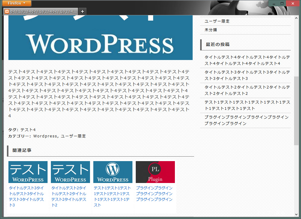
カテゴリID2の最新記事を6つまで表示するという意味です。上の画像には記事が3つしか表示されていませんが、あいにくテスト段階だったので記事が6つもありません、最高6つまで表示するということです。
- 変更、追加したスタイルシート
1234567891011121314151617181920212223242526272829303132333435363738394041#content-blog {margin-bottom: 20px;}.post_home {width: 31%;/display:inline;/zoom:1;display: inline-block;vertical-align: top;margin-top: 0px;margin-right: 0px;margin-bottom: 0px;margin-left: 0px;padding: 0.5%;}.post_home h2 a {font-size: 12px;font-weight: normal;line-height: 1.2em;display: block;clear: both;padding-top: 0px;padding-right: 5px;padding-bottom: 0px;padding-left: 5px;}#content-blog .item1 img {-moz-box-sizing: border-box;-webkit-box-sizing: border-box;box-sizing: border-box;background-color: #FFF;border: 1px solid #FFF;padding: 4px;margin-top: 0px;margin-bottom: 5px;margin-left: 0px;float: right;} - 幅480px以下の調整をします。
wp-content/themes/テーマフォルダ/core/css/style.css
@media screen and (max-width: 480px) {}内に追加
二列にする↓
123456.post_home {width: 48%;}#content-blog .item1 img {width: 100%;}
幅320px以下の調整をします。
@media screen and (max-width: 320px) {} 内に追加
一列にする↓
123456.post_home {width: 99%;}#content-blog .item1 img {width: 100%;} - 一番下のホームウィジェット1,2,3の変更箇所
wp-content/themes/テーマフォルダ/core/includes/functions.php(816~844行あたり)
<div id="widget-title-xxxx" class="widget-title-home"><h3>を↓のように変更。必然的に</h3>を削除。
すべてのタイトルを統一することで、スタイルシートでの変更が容易になります。1234567891011121314151617181920212223242526272829register_sidebar(array('name' => __('Home Widget 1', 'responsive'),'description' => __('Area 6 - sidebar-home.php', 'responsive'),'id' => 'home-widget-1','before_title' => '<div class="widget-title">','after_title' => '</div>','before_widget' => '<div id="%1$s" class="widget-wrapper %2$s">','after_widget' => '</div>'));register_sidebar(array('name' => __('Home Widget 2', 'responsive'),'description' => __('Area 7 - sidebar-home.php', 'responsive'),'id' => 'home-widget-2','before_title' => '<div class="widget-title">','after_title' => '</div>','before_widget' => '<div id="%1$s" class="widget-wrapper %2$s">','after_widget' => '</div>'));register_sidebar(array('name' => __('Home Widget 3', 'responsive'),'description' => __('Area 8 - sidebar-home.php', 'responsive'),'id' => 'home-widget-3','before_title' => '<div class="widget-title">','after_title' => '</div>','before_widget' => '<div id="%1$s" class="widget-wrapper %2$s">','after_widget' => '</div>'));
これでトップページは完了しました。
フッターの編集
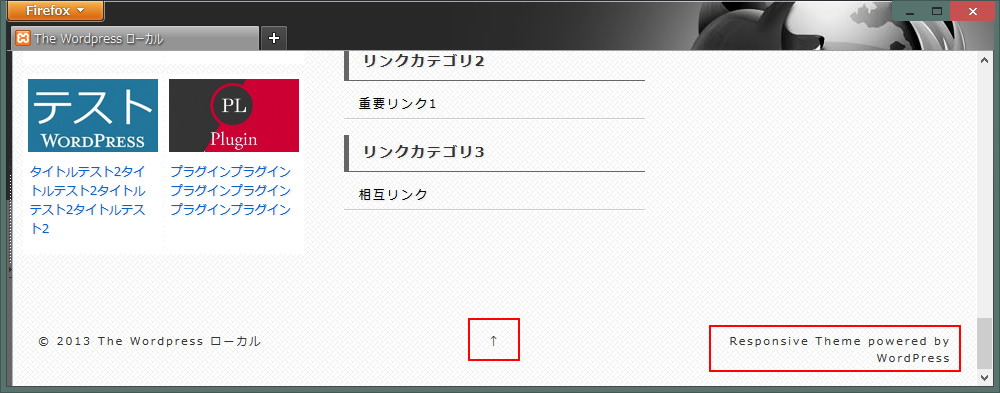
- Responsive Theme powered by WordPressを削除します。
footer.phpから↓を削除
123456<div class="grid col-300 fit powered"><a href="<?php echo esc_url( 'https://cyberchimps.com/responsive-theme/' ); ?>" title="<?php esc_attr_e('Responsive Theme', 'responsive'); ?>">Responsive Theme</a><?php esc_attr_e('powered by', 'responsive'); ?> <a href="<?php echo esc_url( 'https://wordpress.org/' ); ?>" title="<?php esc_attr_e('WordPress', 'responsive'); ?>">WordPress</a></div><!-- end .powered --> - トップへ戻るボタンを編集
footer.phpの‘↑’を好きな文字に置き換える。日本語を記入する場合、文字化けするので、UTF-8にエンコードします。
1<div class="grid col-300 scroll-top"><a href="#scroll-top" title="<?php esc_attr_e( 'scroll to top', 'responsive' ); ?>"><?php _e( 'トップ', 'responsive' ); ?></a></div>※トップへ戻るが必要ない場合、またはプラグインのトップへ戻るjcwp scroll to topなどを使用する場合↑を全部削除してかまいません。
- #footer aと#footer a:hoverを空にします。 削除してもOK
12#footer a {}#footer a:hover {}
- .scroll-top aを追加します。
123456789101112.scroll-top a {padding-top: 10px;padding-bottom: 10px;text-align: center;display: block;color: #FFF;background-color: #999;}.scroll-top a:hover {background-color: #333;}
- ホバータイムをかけるので#wrapper a ,#wrapper imgに.scroll-top aを追加します。
1234567#wrapper a ,#wrapper img, .scroll-top a {-webkit-transition: 0.2s;-moz-transition: 0.2s;-o-transition: 0.2s;-ms-transition: 0.2s;transition: 0.2s;}
↓こんな感じになりました。以上で既存のフロントページの編集は完了です。
既存のフロントページを使わない場合のトップページも編集してみます。
外観 > テーマ設定 > ホームページ > Enable Custom Front Page の Enable Custom Front Page
Overrides the WordPressのチェックを外します。
home.phpを編集します。UTF-8にエンコードします。
#content-blog内をフロントページで作成したものと入れ替えます。
- ↓フロントページで作成したやつです。
1234567891011121314151617181920212223242526272829<div class="widget-title">WordPressテクニック</div><?php$loop = new WP_Query('cat=2&showposts=6');while ( $loop->have_posts() ) : $loop->the_post();?></li><li class="post_home"><div class="item1"><a href="<?php the_permalink() ?>"><?php the_post_thumbnail('medium'); ?></a></div><h2><a href="<?php the_permalink(); ?>"><?php the_title(); ?></a></h2></li><?php endwhile;wp_reset_query(); ?><div class="widget-title">WordPress プラグイン</div><?php$loop = new WP_Query('cat=19&showposts=6');while ( $loop->have_posts() ) : $loop->the_post();?><li class="post_home"><div class="item1"><a href="<?php the_permalink() ?>"><?php the_post_thumbnail('medium'); ?></a></div><h2><a href="<?php the_permalink(); ?>"><?php the_title(); ?></a></h2></li><?php endwhile;wp_reset_query(); ?>
#content-blog内を入れ替えるとこんな感じ↓
123456789101112131415161718192021222324252627282930313233<div id="content-blog" class="<?php echo implode( ' ', responsive_get_content_classes() ); ?>"><div class="widget-title">WordPressテクニック</div><?php$loop = new WP_Query('cat=2&showposts=6');while ( $loop->have_posts() ) : $loop->the_post();?><li class="post_home"><div class="item1"><a href="<?php the_permalink() ?>"><?php the_post_thumbnail('medium'); ?></a></div><h2><a href="<?php the_permalink(); ?>"><?php the_title(); ?></a></h2></li><?php endwhile;wp_reset_query(); ?><div class="widget-title">WordPress プラグイン</div><?php$loop = new WP_Query('cat=19&showposts=6');while ( $loop->have_posts() ) : $loop->the_post();?><li class="post_home"><div class="item1"><a href="<?php the_permalink() ?>"><?php the_post_thumbnail('medium'); ?></a></div><h2><a href="<?php the_permalink(); ?>"><?php the_title(); ?></a></h2></li><?php endwhile;wp_reset_query(); ?></divvvvvvvvv>←表示の都合上実際よりv多めです。消してください<!-- end of #content-blog -->- 既存のフロントページ同様、下に3つのウィジェットを表示したい場合
↓をsidebarとfooterの間に追加
1<?php get_sidebar('home'); ?>
↓こんな感じ
123<?php get_sidebar(); ?><?php get_sidebar('home'); ?><?php get_footer(); ?>
archive.php、search.php、single.phpも同様に追加します。
これで完成ですが、少し寂しいのでスライドショーを挿入します。
スライドショーを挿入

- フロントページで使ったWordPress Slider Pluginを使います。
1<?php muneeb_ssp_slider( 126 );?>
↑をcontent-blogの下に追加
※126は、ショートコードの slider id=’126‘ name=’スライド1’
12div id="content-blog" class="<?php echo implode( ' ', responsive_get_content_classes() ); ?>"><?php muneeb_ssp_slider( 126 );?>
これで基本的なデザインはすべて終了ですが、上部のカテゴリメニューを固定する方法を説明します。
上部のカテゴリメニューを固定
- 上部のカテゴリメニューを固定させてみようと思います。
カテゴリメニューをposition: fixedで固定します。
123456.main-nav {z-index: 9999;position: fixed;width: 100%;background-color: #585858;}
幅650px以下の微調整をします。
wp-content/themes/テーマフォルダ/core/css/style.css
@media screen and (max-width: 650px) {}内の↓を空にします。
123.js .main-nav {} - bodyに割り当てているカテゴリメニューの背景を固定します。メインの背景はそのままのscrollで、カテゴリメニューの背景をfixedで固定します。bodyに2枚の背景画像を使っているのでややこしくなっています。
1234567891011121314151617181920212223body {-moz-font-smoothing: antialiased;-webkit-font-smoothing: antialiased;color: #000;font-size: 14px;font-smoothing: antialiased;line-height: 1.5em;text-rendering: optimizeLegibility;background-attachment: fixed,scroll; /*変更箇所*/font-family: "メイリオ", Meiryo;/*背景画像を2つ指定*/background-image:url(../../../images/back/memu_back02.jpg),url(../../../images/back/cream_pixels.png);/*繰り返すかを指定*/background-repeat:repeat-x,repeat;/*位置を指定*/background-position:center top,0 0;} - position: fixedでずれたメニューの高さ45px分を修正します。このサイトの場合対象がロゴとTop Widget(検索)になります。
1234567891011#logo {float: left;margin: 0;padding-top: 45px;}#top-widget {margin-bottom: 5px;margin-top: 10px;padding-top: 45px;} - ブラウザ Chrome用の微調整。(カテゴリメニューの上にコンテンツが表示されるのをz-index: 999で回避)
12345678#menu_fixed {position: fixed;max-width: 950px;margin: 0px;padding: 0px;width: 98%;z-index: 999;} - 幅650px以下の微調整をします。
wp-content/themes/テーマフォルダ/core/css/style.css
@media screen and (max-width: 650px) {}内に↓を追加。
123#top-widget {padding-top: 0px;}
ここまで本当にお疲れ様でした。


コメントを残す